 Just to share with the readers what I found during my research of company corporate websites. Love how corporate websites can be fun and creative yet bring out their brand message and products.
1) Use the selling product as website graphic

Suits a stationary retailer website design. I like the post-it, sharpener, pencil and paper graphic used. Bright red background with a focus pin light at the centre accentuate the body content.
2) Go colourful

Love the textured background. My favourite is still the bright colours used in each header and sub header. Great for a food company website.
3) Monotonous palette with some accent colours

I like the different shades from white to black used in the top menu. The colour of each page corresponds to each menu title colour. [Updated on 1 May 2015 – Ya Kun has revamped their website. The design is no longer the same as above image.]
4) Display the brand image

Play with the sentimental value like the vintage tag as menu links and notebook paper as background. Cohesive colour palette used throughout the site with their corporate colour red. [Updated on 1 May 2015 – Ya Kun has revamped their website. The design is no longer the same as above image.]
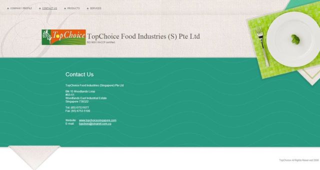
5) Use of refreshing colours

I like the texture background and the refreshing turquoise colour used for this food product site.
6) Cute Mascot

Who don’t like cute stuff! Like TSK’s sweet colours and cute monkey mascot. [Updated on 1 May 2015 – TSK has revamped their website. The design is no longer the same as above image, however, the cute mascot remains!]
7) Don’t be afraid of dark

Great colour scheme for a food product site. Like the dark green, beige and white colours used.
8) Use of unique font

Love the texture and font used. Matches its brand identity. [Updated on 1 May 2015 – Sunshine Bakeries has revamped their website. The design is no longer the same as above image.]
9) Use of subtle gradient

Create a sense of depth with the subtle shading. Love this food manufacturer’s website colour scheme and banner/ribbon style menu.
10) Go elegant style

I like the overall look. Suit its product image. Great colour scheme, patterned background and matching graphic used.
11) Integrate large photo background

Specialised in recycled wood furniture, I like its use of wooden plank background. Especially in love with contact page graphic element. [Updated on 1 May 2015 – d-Bodhi has revamped their website. The design is no longer the same as above image.]
12) Play of words

I like its use of the negative space – ample area of white background which bring focus to the text. The typography and layout make the link contents more interesting.
13) Illustrations speak a thousand words

I like the classic style, scallop edge header and vintage illustration.
14) Collage style web layout

Play with geometry shapes and frame the content differently.
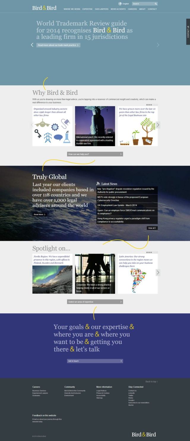
15) Single page site with a unique connector

Like how the use of yellow the accent colour is used. Connect different component of the page cohesively.Truly bring the message across. Notice the company name and its website address – Bird & Bird vs twobirds.com.
More webspiration can be found at my Pinterest board, here.
>>>>> Thanks for visiting! <<<<<
alittletypical is on facebook | pinterest| instagram | bloglovin | shop
I like cute mascot and play of words.
LikeLike
HI! Are you a graphic designer? :D
LikeLike
Nope. I’m working in an industry not even close to design. Just like to collect interesting graphics and inspiration.
LikeLiked by 1 person
These are all great and inspiring! I love the colours on Hupco! But Le Article is interesting, too! Definitely my favourite!
LikeLike
i’m going to post more interesting corporate website in coming week. Stay tuned!
LikeLike